1.PRESENTATION
The Solomon R. Guggenheim Museum

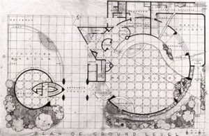
The Solomon R. Guggenheim Museum New York, designed by Frank Lloyd Wright, is one of the most important architectural landmarks of the 20th century. Located on the Upper East Side, right next to Central Park, the Guggenheim Museum, with its characteristic spiral silhouette, has become one of the emblems of New York City. The museum first opened on 21 October 1959, six months after the death of Frank Lloyd Wright and ten years after the death of founder Solomon Guggenheim. Wright spent 16 years, 700 sketches and six sets of different plans to complete the project.
2. ANALYSIS
Aspect 1: Impact of the museum at the time:
Solomon R. Guggenheim, an American mogul who, encouraged and guided by artist and art consultant Hilla Rebay, started an art collection in the late 1920s, wanted his museum to be totally different from any other in the world to coincide with the new radical art form. To this end, she proposed to architect Frank Lloyd Wright to create the best environment to show art; therefore, Wright proposed «a large continuous space» that she would develop with levels of ramps.
When entering the building, the first thing you find is a huge void (at whose sides we find the ramp) over 25m high, covered by a glass dome. The idea behind this void is to allow visitors to experience «going up to the sky» as they walk through the museum. Another of the concepts of the building’s design is that visitors can go up the elevator to the last level, to begin their descent enjoying the exhibits connected to each other by the ramp and illuminated with natural light thanks to the dome.

Aspect 2: The contrast of the building with the rest of Manhattan and at the same time the fusion of it with nature:
The main characteristic of the building from the outside is its white cylindrical shape made of concrete, which resembles a whirlpool that rises to the sky, although its proposal was the similarity to the shell of a Nautilius, with continuous spaces that flow among each other. The spiral floors can be seen both from the outside of the building and from the inside.
Despite the organic design of the building, it also expresses the rigid geometry of modern architecture. When we read the explanation of the design directly from the designer himself, we can identify the message in each of the geometric shapes and the human ideas and feelings.
It was expected that at the time the building was designed and constructed it would cause a great deal of controversy due to the contrast it produced with the rest of the buildings in the Manhattan grid.
Aspect 3. Criticism for the fact that the museum is a work of art in itself and that it eclipses the works exhibited in it.
Despite the fact that the space contained by the building is undoubtedly majestic and the building itself is monumental, thanks among other things to the majesty of the design and the intentionality in the curved shape of its walls so that the works give the sensation of being supported on a lectern, it was not successful in terms of its function because it was very complicated to hang the works.
Because of this, before the opening 21 artists signed a letter complaining about the exhibition space. Many critics also argued that the building itself competes with the works of art on display, a problem that James Johnson Sweeney (the museum’s director) took very seriously, saying, «This is, architecturally, the best museum interior in the country. But my job is to showcase magnificent collections at their best.
Despite the critics’ opinion, there is no doubt that Wright’s design for the Guggenheim museum gives a unique spatial freedom in its style. It took Wright 700 drawings and six sets of working drawings to turn his vision into the extraordinary sculpture of a building overlooking Central Park.

